Slider
Slider[x]
represents a slider with setting x in the range 0 to 1.
takes the setting to be the dynamically updated current value of x, with the value of x being reset if the slider is moved.
Slider[x,{xmin,xmax}]
represents a slider with range xmin to xmax.
Slider[x,{xmin,xmax,dx}]
represents a slider that jumps in steps dx.
Slider[x,{{e1,e2,…}}]
represents a slider in which equally spaced intervals correspond to successive settings ei.
Slider[x,{{{e1,w1},{e2,w2},…}}]
uses intervals of relative widths wi for the ei.
Details and Options
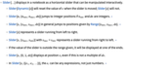
- Slider[…] displays in a notebook as a horizontal slider that can be manipulated interactively.
- Slider[Dynamic[x]] will reset the value of x when the slider is moved; Slider[x] will not.
- Slider[n,{nmin,nmax,dn}] jumps to integer positions if nmin and dn are integers. »
- Slider[x,{xmin,xmax,dx}] in general jumps to positions given by Range[xmin,xmax,dx]. »
- Slider[x] represents a slider running from left to right.
- Slider[x,{xmax,xmin}] with xmax > xmin represents a slider running from right to left. »
- If the value of the slider is outside the range given, it will be displayed at one of the ends.
- Slider[x,{0,1,dx}] displays at position x, even if this is not a multiple of dx.
- In Slider[x,{{e1,e2,…}}], the ei can be any expressions, not just numbers. »
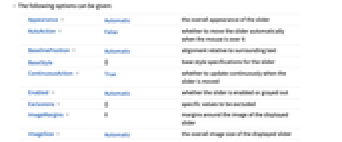
- The following options can be given:
-
Appearance Automaticthe overall appearance of the slider AutoAction Falsewhether to move the slider automatically when the mouse is over it BaselinePosition Automaticalignment relative to surrounding text BaseStyle{}base style specifications for the slider ContinuousAction Truewhether to update continuously when the slider is moved Enabled Automaticwhether the slider is enabled or grayed out Exclusions {}specific values to be excluded ImageMargins 0margins around the image of the displayed slider ImageSize Automaticthe overall image size of the displayed slider - Possible settings for Appearance include Tiny, Small, Medium, and Large, as well as typically some other settings such as "UpArrow" and "DownArrow".
- Appearance->"Labeled" displays the current value of the slider as an editable label.
- The settings for BaseStyle are appended to the default style typically given by the "Slider" style in the current stylesheet.
- Slider[] is equivalent to Slider[0.5].
- The resulting slider can be finely manipulated by holding down the
 key (or
  on Macintosh) while dragging the mouse. This causes the slider to move at 1/20 the rate of the mouse. The slider can be even more finely manipulated by also holding the
  and/or
  keys.
keys.
Examples
open allclose allBasic Examples (3)
A slider set at  in the default range
  to
to  :
:
A slider with its value updated dynamically:
A slider with integer values in the range  to
to  :
:
Scope (5)
Use the range  to
to  , increasing when going from left to right:
A slider with range  to
to  , increasing when going from right to left:
Use only integer variable values:
Use a list of possible values:
Change the relative width corresponding to each possible value:
Options (20)
Appearance (4)
Special arrow appearances are available on some platforms:
Use dynamic appearance, based on whether Round[x] is  or
or  :
:
AutoAction (2)
By default, no slider values change until you click in the slider area:
By setting AutoAction, the slider values change as the mouse moves over the slider area:
Background (2)
Change the background color dynamically:
BaselinePosition (2)
Align with the surrounding text:
Dynamically change the baseline position:
ContinuousAction (2)
By default, variables are continuously updated:
Setting ContinuousAction to False makes variables update only when the slider is released:
Enabled (2)
By default, Slider is enabled:
By setting Enabled->False, the slider is disabled but visible in its current state:
Exclusions (1)
Exclude values from the range:
ImageMargins (1)
By setting ImageMargins, you make the slider area larger:
ImageSize (4)
By setting the second element, you can also control the height reserved by the slider:
Applications (2)
") prime:
prime:Selecting the n") digit in the decimal expansion of π:
digit in the decimal expansion of π:
Possible Issues (1)
Appearances provided by the operating system may be different or unavailable on other platforms:
Generic appearances are available on all platforms:
Neat Examples (1)
Text
Wolfram Research (2007), Slider, Wolfram Language function, https://reference.wolfram.com/language/ref/Slider.html (updated 2008).
CMS
Wolfram Language. 2007. "Slider." Wolfram Language & System Documentation Center. Wolfram Research. Last Modified 2008. https://reference.wolfram.com/language/ref/Slider.html.
APA
Wolfram Language. (2007). Slider. Wolfram Language & System Documentation Center. Retrieved from https://reference.wolfram.com/language/ref/Slider.html