Google Workspace Updates: New community features for Google Chat and an update on Currents
html {
font-family: Roboto, sans-serif;
-moz-osx-font-smoothing: grayscale;
-webkit-font-smoothing: antialiased;
}
body {
padding: 0;
/* This ensures that the scroll bar is always present, which is needed */
/* because content render happens after page load; otherwise the header */
/* would "bounce" in-between states. */
min-height: 150%;
}
h2 {
font-size: 16px;
}
h1, h2, h3, h4, h5 {
line-height: 2em;
}
html, h4, h5, h6 {
font-size: 14px;
}
a, a:visited {
color: #4184F3;
text-decoration: none;
}
a:focus, a:hover, a:active {
text-decoration: none;
}
.Header {
margin-top: 15px;
}
.Header h1 {
font-size: 32px;
font-weight: 300;
line-height: 32px;
height: 42px;
}
.header-inner .Header .titlewrapper {
padding: 0;
margin-top: 30px;
}
.header-inner .Header .descriptionwrapper {
padding: 0;
margin: 0;
}
.cols-wrapper {
margin-top: 56px;
}
.header-outer, .cols-wrapper, .footer-outer, .google-footer-outer {
padding: 0 60px;
}
.header-inner {
height: 256px;
position: relative;
}
html, .header-inner a {
color: #212121;
color: rgba(0,0,0,.87);
}
.header-inner .google-logo {
display: inline-block;
background-size: contain;
z-index: 1;
height: 60px;
overflow: hidden;
margin-top: 4px;
margin-right: 8px;
}
.header-left {
position: absolute;
top: 50%;
-webkit-transform: translateY(-50%);
transform: translateY(-50%);
margin-top: 12px;
width: 100%;
}
.google-logo {
margin-left: -4px;
}
#google-footer {
position: relative;
font-size: 13px;
list-style: none;
text-align: right;
}
#google-footer a {
color: #444;
}
#google-footer ul {
margin: 0;
padding: 0;
height: 144px;
line-height: 144px;
}
#google-footer ul li {
display: inline;
}
#google-footer ul li:before {
color: #999;
content: "\00b7";
font-weight: bold;
margin: 5px;
}
#google-footer ul li:first-child:before {
content: '';
}
#google-footer .google-logo-dark {
left: 0;
margin-top: -16px;
position: absolute;
top: 50%;
}
/** Sitemap links. **/
.footer-inner-2 {
font-size: 14px;
padding-top: 42px;
padding-bottom: 74px;
}
.footer-inner-2 .HTML h2 {
color: #212121;
color: rgba(0,0,0,.87);
font-size: 14px;
font-weight: 500;
padding-left: 0;
margin: 10px 0;
}
.footer-inner-2 .HTML ul {
font-weight: normal;
list-style: none;
padding-left: 0;
}
.footer-inner-2 .HTML li {
line-height: 24px;
padding: 0;
}
.footer-inner-2 li a {
color: rgba(65,132,243,.87);
}
/** Archive widget. **/
.BlogArchive {
font-size: 13px;
font-weight: normal;
}
.BlogArchive .widget-content {
display: none;
}
.BlogArchive h2, .Label h2 {
color: #4184F3;
text-decoration: none;
}
.BlogArchive .hierarchy li {
display: inline-block;
}
/* Specificity needed here to override widget CSS defaults. */
.BlogArchive #ArchiveList ul li, .BlogArchive #ArchiveList ul ul li {
margin: 0;
padding-left: 0;
text-indent: 0;
}
.BlogArchive .intervalToggle {
cursor: pointer;
}
.BlogArchive .expanded .intervalToggle .new-toggle {
-ms-transform: rotate(180deg);
transform: rotate(180deg);
}
.BlogArchive .new-toggle {
float: right;
padding-top: 3px;
opacity: 0.87;
}
#ArchiveList {
text-transform: uppercase;
}
#ArchiveList .expanded > ul:last-child {
margin-bottom: 16px;
}
#ArchiveList .archivedate {
width: 100%;
}
/* Months */
.BlogArchive .items {
max-width: 150px;
margin-left: -4px;
}
.BlogArchive .expanded .items {
margin-bottom: 10px;
overflow: hidden;
}
.BlogArchive .items > ul {
float: left;
height: 32px;
}
.BlogArchive .items a {
padding: 0 4px;
}
.Label {
font-size: 13px;
font-weight: normal;
}
.sidebar-icon {
display: inline-block;
width: 24px;
height: 24px;
vertical-align: middle;
margin-right: 12px;
margin-top: -1px
}
.Label a {
margin-right: 4px;
}
.Label .widget-content {
display: none;
}
.FollowByEmail {
font-size: 13px;
font-weight: normal;
}
.FollowByEmail h2 {
background: url("data:image/png;base64,iVBORw0KGgoAAAANSUhEUgAAABEAAAALCAYAAACZIGYHAAAAGXRFWHRTb2Z0d2FyZQBBZG9iZSBJbWFnZVJlYWR5ccllPAAAAUBJREFUeNrMkSGLAlEUhb+ZB4JFi8mx2cz+ApvhRUGTcUCrNqNJDYIi+DO0GUwmQXDK2DSIoGgZcSaIjDrzwrK4ssvChj1w0733O+fdp+m6PozH4yQSCfb7Pa7r8pOi0SjJZBLP8zgej4gAIMvlMuPxmADIYrHger1+C6lUKmo+NJ/NZojb7SZDWiwWo1qtks1msW2bw+HwZdkwDHq9HvV6nel0SqvVYrvdIh6Ph3Qch+VyqRYLhQJSSjRNw7IsfN9XgGKxSLfbJZfL0e/3aTabrFYr7vc7IujLcOh8PqunrNdr0uk0pVKJVCpFJBJRgEajweVyod1uMxgM2O12BAGUgRbU8DV2JpOhVquRz+cRQii3+XxOp9NRN3jVR5LPOp1OjEYjlSL8hclkgmmabDabt4d+m+S30vkD/R/IU4ABAPTZgnZdmG/PAAAAAElFTkSuQmCC");
background-repeat: no-repeat;
background-position: 3% 50%;
text-indent: 39px;
}
.FollowByEmail .widget-content {
display: none;
}
.searchBox input {
border: 1px solid #eee;
color: #212121;
color: rgba(0,0,0,.87);
font-size: 14px;
padding: 8px 8px 8px 40px;
width: 164px;
font-family: Roboto, sans-serif;
background: url("https://www.gstatic.com/images/icons/material/system/1x/search_grey600_24dp.png") 8px center no-repeat;
}
.searchBox ::-webkit-input-placeholder { /* WebKit, Blink, Edge */
color: rgba(0,0,0,.54);
}
.searchBox :-moz-placeholder { /* Mozilla Firefox 4 to 18 */
color: #000;
opacity: 0.54;
}
.searchBox ::-moz-placeholder { /* Mozilla Firefox 19+ */
color: #000;
opacity: 0.54;
}
.searchBox :-ms-input-placeholder { /* Internet Explorer 10-11 */
color: #757575;
}
.widget-item-control {
margin-top: 0px;
}
.section {
margin: 0;
padding: 0;
}
#sidebar-top {
border: 1px solid #eee;
}
#sidebar-top > div {
margin: 16px 0;
}
.widget ul {
line-height: 1.6;
}
/*main post*/
.post {
margin-bottom:30px;
}
#main .post .title {
margin: 0;
}
#main .post .title a {
color: #212121;
color: rgba(0,0,0,.87);
font-weight: normal;
font-size: 24px;
}
#main .post .title a:hover {
text-decoration:none;
color:#4184F3;
}
.message, #main .post .post-header {
margin: 0;
padding: 0;
}
#main .post .post-header .caption, #main .post .post-header .labels-caption, #main .post .post-footer .caption, #main .post .post-footer .labels-caption {
color: #444;
font-weight: 500;
}
#main .tr-caption-container td {
text-align: left;
}
#main .post .tr-caption {
color: #757575;
color: rgba(0,0,0,.54);
display: block;
max-width: 560px;
padding-bottom: 20px;
}
#main .post .tr-caption-container {
line-height: 24px;
margin: -1px 0 0 0 !important;
padding: 4px 0;
text-align: left;
}
#main .post .post-header .published{
font-size:11px;
font-weight:bold;
}
.post-header .publishdate {
font-size: 17px;
font-weight:normal;
color: #757575;
color: rgba(0,0,0,.54);
}
#main .post .post-footer{
font-size:12px;
padding-bottom: 21px;
}
.label-footer {
margin-bottom: 12px;
margin-top: 12px;
}
.comment-img {
margin-right: 16px;
opacity: 0.54;
vertical-align: middle;
}
#main .post .post-header .published {
margin-bottom: 40px;
margin-top: -2px;
}
.post .post-content {
color: #212121;
color: rgba(0,0,0,.87);
font-size: 17px;
margin: 25px 0 36px 0;
line-height: 32px;
}
.post-body .post-content ul, .post-body .post-content ol {
margin: 16px 0;
padding: 0 48px;
}
.post-summary {
display: none;
}
/* Another old-style caption. */
.post-content div i, .post-content div + i {
font-size: 17px;
/*font-style: normal;*/
/*color: #757575;
color: rgba(0,0,0,.54);*/
line-height: 28px;
margin-bottom: 7px;
text-align: left;
}
/* Another old-style caption (with link) */
.post-content a > i {
color: #4184F3 !important;
}
/* Old-style captions for images. */
.post-content .separator + div:not(.separator) {
margin-top: -16px;
}
/* Capture section headers. */
.post-content br + br + b, .post-content .space + .space + b, .post-content .separator + b {
display: inline-block;
margin-bottom: 8px;
margin-top: 24px;
}
.post-content li {
line-height: 32px;
}
/* Override all post images/videos to left align. */
.post-content .separator, .post-content video {
text-align: left;
}
.post-content .separator > a, .post-content .separator > span {
margin-left: 0 !important;
}
.post-content img {
max-width: 100%;
height: auto;
width: auto;
text-align: center !important;
}
.post-content .tr-caption-container img {
margin-bottom: 12px;
}
.post-content iframe, .post-content embed {
max-width: 100%;
}
.post-content .carousel-container {
margin-bottom: 48px;
}
/*
#main .post-content b {
font-weight: 500;
}*/
/* These are the main paragraph spacing tweaks. */
#main .post-content br {
content: ' ';
display: block;
padding: 4px;
}
.post-content .space {
display: block;
height: 8px;
}
.post-content iframe + .space, .post-content iframe + br {
padding: 0 !important;
}
#main .post .jump-link {
margin-bottom:10px;
}
.post-content img, .post-content iframe {
margin: 30px 0 20px 0;
}
.post-content > img:first-child, .post-content > iframe:first-child {
margin-top: 0;
}
.col-right .section {
padding: 0 16px;
}
#aside {
background:#fff;
border:1px solid #eee;
border-top: 0;
}
#aside .widget {
margin:0;
}
#aside .widget h2, #ArchiveList .toggle + a.post-count-link {
color: #212121;
color: rgba(0,0,0,.87);
font-weight: 400 !important;
margin: 0;
}
#ArchiveList .toggle {
float: right;
}
#ArchiveList .toggle .material-icons {
padding-top: 4px;
}
#sidebar .tab {
cursor: pointer;
}
#sidebar .tab .arrow {
display: inline-block;
float: right;
}
#sidebar .tab .icon {
display: inline-block;
vertical-align: top;
height: 24px;
width: 24px;
margin-right: 13px;
margin-left: -1px;
margin-top: 1px;
color: #757575;
color: rgba(0,0,0,.54);
}
#sidebar .widget-content > :first-child {
padding-top: 8px;
}
#sidebar .active .tab .arrow {
-ms-transform: rotate(180deg);
transform: rotate(180deg);
}
#sidebar .arrow {
color: #757575;
color: rgba(0,0,0,.54);
}
#sidebar .widget h2 {
font-size: 14px;
line-height: 24px;
display: inline-block;
}
#sidebar .widget .BlogArchive {
padding-bottom: 8px;
}
#sidebar .widget {
border-bottom: 1px solid #eee;
box-shadow: 0px 1px 0 white;
margin-bottom: 0;
padding: 14px 0;
min-height: 20px;
}
#sidebar .widget:last-child {
border-bottom: none;
box-shadow: none;
margin-bottom: 0;
}
#sidebar ul {
margin: 0;
padding: 0;
}
#sidebar ul li {
list-style:none;
padding:0;
}
#sidebar ul li a {
line-height: 32px;
}
#sidebar .archive {
background-image: url("data:image/png;base64,iVBORw0KGgoAAAANSUhEUgAAABAAAAAYCAYAAADzoH0MAAAAGXRFWHRTb2Z0d2FyZQBBZG9iZSBJbWFnZVJlYWR5ccllPAAAAE1JREFUeNpiNDY23s9AAWBioBCwYBM8c+YMVsUmJibEGYBNMS5DaeMFfDYSZQA2v9I3FrB5AZeriI4FmnrBccCT8mhmGs1MwyAzAQQYAKEWG9zm9QFEAAAAAElFTkSuQmCC");
height: 24px;
line-height: 24px;
padding-left: 30px;
}
#sidebar .labels {
background-image: url("data:image/png;base64,iVBORw0KGgoAAAANSUhEUgAAABEAAAARCAYAAAA7bUf6AAAAGXRFWHRTb2Z0d2FyZQBBZG9iZSBJbWFnZVJlYWR5ccllPAAAAUxJREFUeNpiNDY23s9AAMycOfM7UF05kHkZmzwTMkdSUhKrIcXFxZy3bt3qBjIN8RrS09PDsHnzZjCNDr58+cKQlpbGDjSoHcg1w2oIyAUODg5gARCNzUVIBrUCuVYYhjx//pzhwIEDYAEQDeJjA1CDWIAGNQK59jBxRuSABbkAlwHIgIeHh2HWrFn/1NTU2oDcvSgBS4wBSC5iArqoCsj1YGIgEyAZVMoEchqlBjEB/cZAiUHg2AEGznpKDAImxOeM////B4VLKtBvEUCngZ1ILKivr3/u6+ubBzJAGZQ9gC5aQoqLgAY8BhkAZL4BuQQkxgXE34A4BuiiZEIuAhrwEGhAEZD5DpzYoIaA2UAM4kQADUrHZRDUgAIg8wO2XAwzbQXQa5OweQ1owB10AyA6gS7BgX1u3ry5397eHow3bdo0EyjGi00tQIABANPgyAH1q1eaAAAAAElFTkSuQmCC");
height: 20px;
line-height: 20px;
padding-left: 30px;
}
#sidebar .rss a {
background-image: url("data:image/png;base64,iVBORw0KGgoAAAANSUhEUgAAABIAAAASCAYAAABWzo5XAAAAGXRFWHRTb2Z0d2FyZQBBZG9iZSBJbWFnZVJlYWR5ccllPAAAAX5JREFUeNqsVDGSgkAQHL2rIiIikohIc/EBRkbwAIwuwgfwAXiAD9AHSI7kEkECRCb6AIyINDLx7K0aa6kT7uq0q7YYtnZ7umdnt7darXbr9Zpegeu61DNNc0dvwCcH4/GYJpMJnc9nOhwOVJbl/4hAAokMECZJQtvt9k+kH7qufyEYDAakqqqYxFdRFBqNRmTbNg2HQ0rTlK7XayvR0xqBdDqdkuM4dE/0ULhYLOh4PHYrknG5XGi/31MYhuL/nkwonM1mlGUZ1XXdrsiyLGEDhY7juJEZ1u5tIixDGdYhmYw+B7CAzPP5nDabjdgIAgCksMX1832/3drtdqPT6SQWapomiGEFNkDEdpDMMAzK81ys/7XYy+XyoQgq2WoURSIJ2iIIgp/WZCCTvFm2wgeAU31aI3Q2GhIDMeB53qPYPIcm5VrxXIOIOxsDMStjVawAc1VViRgN22lNBiuQN3GR+SY07hpOoStmFQAKXRRFY93bnpG+fONfedi+BRgAbkS8Fxp7QQIAAAAASUVORK5CYII=");
}
#sidebar .subscription a {
background-image: url("data:image/png;base64,iVBORw0KGgoAAAANSUhEUgAAABEAAAALCAYAAACZIGYHAAAAGXRFWHRTb2Z0d2FyZQBBZG9iZSBJbWFnZVJlYWR5ccllPAAAAUBJREFUeNrMkSGLAlEUhb+ZB4JFi8mx2cz+ApvhRUGTcUCrNqNJDYIi+DO0GUwmQXDK2DSIoGgZcSaIjDrzwrK4ssvChj1w0733O+fdp+m6PozH4yQSCfb7Pa7r8pOi0SjJZBLP8zgej4gAIMvlMuPxmADIYrHger1+C6lUKmo+NJ/NZojb7SZDWiwWo1qtks1msW2bw+HwZdkwDHq9HvV6nel0SqvVYrvdIh6Ph3Qch+VyqRYLhQJSSjRNw7IsfN9XgGKxSLfbJZfL0e/3aTabrFYr7vc7IujLcOh8PqunrNdr0uk0pVKJVCpFJBJRgEajweVyod1uMxgM2O12BAGUgRbU8DV2JpOhVquRz+cRQii3+XxOp9NRN3jVR5LPOp1OjEYjlSL8hclkgmmabDabt4d+m+S30vkD/R/IU4ABAPTZgnZdmG/PAAAAAElFTkSuQmCC");
}
#sidebar-bottom {
background: #f5f5f5;
border-top:1px solid #eee;
}
#sidebar-bottom .widget {
border-bottom: 1px solid #e0e0e0;
padding: 15px 0;
text-align: center;
}
#sidebar-bottom > div:last-child {
border-bottom: 0;
}
#sidebar-bottom .text {
line-height: 20px;
}
/* Home, forward, and backward pagination. */
.blog-pager {
border-top : 1px #e0e0e0 solid;
padding-top: 10px;
margin-top: 15px;
text-align: right !important;
}
#blog-pager {
margin-botom: 0;
margin-top: -14px;
padding: 16px 0 0 0;
}
#blog-pager a {
display: inline-block;
}
.blog-pager i.disabled {
opacity: 0.2 !important;
}
.blog-pager i {
color: black;
margin-left: 16px;
opacity: 0.54;
}
.blog-pager i:hover, .blog-pager i:active {
opacity: 0.87;
}
#blog-pager-older-link, #blog-pager-newer-link {
float: none;
}
.gplus-profile {
background-color: #fafafa;
border: 1px solid #eee;
overflow: hidden;
width: 212px;
}
.gplus-profile-inner {
margin-left: -1px;
margin-top: -1px;
}
/* Sidebar follow buttons. */
.followgooglewrapper {
padding: 12px 0 0 0;
}
.loading {
visibility: hidden;
}
.detail-page .post-footer .cmt_iframe_holder {
padding-top: 40px !important;
}
/** Desktop **/
@media (max-width: 900px) {
.col-right {
display: none;
}
.col-main {
margin-right: 0;
min-width: initial;
}
.footer-outer {
display: none;
}
.cols-wrapper {
min-width: initial;
}
.google-footer-outer {
background-color: #f5f5f5;
}
}
/** Tablet **/
@media (max-width: 712px) {
.header-outer, .cols-wrapper, .footer-outer, .google-footer-outer {
padding: 0 40px;
}
}
/* An extra breakpoint accommodating for long blog titles. */
@media (max-width: 600px) {
.header-left {
height: 100%;
position: initial;
top: inherit;
margin-top: 0;
-webkit-transform: initial;
transform: initial;
}
.header-title {
margin-top: 18px;
}
.header-inner {
height: auto;
margin-bottom: 32px;
margin-top: 32px;
}
.header-desc {
margin-top: 12px;
}
.header-inner .google-logo {
height: 40px;
margin-top: 3px;
}
.header-inner .google-logo img {
height: 42px;
}
.header-title h2 {
font-size: 32px;
line-height: 50px;
}
}
/** Mobile/small desktop window; also landscape. **/
@media (max-width: 480px), (max-height: 480px) {
.header-outer, .cols-wrapper, .footer-outer, .google-footer-outer {
padding: 0 16px;
}
.cols-wrapper {
margin-top: 0;
}
.post-header .publishdate, .post .post-content {
font-size: 16px;
}
.post .post-content {
line-height: 28px;
margin-bottom: 30px;
}
.post {
margin-top: 30px;
}
.byline-author {
display: block;
font-size: 12px;
line-height: 24px;
margin-top: 6px;
}
#main .post .title a {
font-weight: 500;
color: #4c4c4c;
color: rgba(0,0,0,.70);
}
#main .post .post-header {
padding-bottom: 12px;
}
#main .post .post-header .published {
margin-bottom: -8px;
margin-top: 3px;
}
.post .read-more {
display: block;
margin-top: 14px;
}
.post .tr-caption {
font-size: 12px;
}
#main .post .title a {
font-size: 20px;
line-height: 30px;
}
.post-content iframe {
/* iframe won't keep aspect ratio when scaled down. */
max-height: 240px;
}
.post-content .separator img, .post-content .tr-caption-container img {
/*width: 100%;*/
}
.post-content iframe {
max-width: inherit;
}
.post-content table, .post-content td {
width: 100%;
}
#blog-pager {
margin: 0;
padding: 16px 0;
}
/** List page tweaks. **/
.list-page .post-original {
display: none;
}
.list-page .post-summary {
display: block;
}
.list-page .comment-container {
display: none;
}
.list-page #blog-pager {
padding-top: 0;
border: 0;
margin-top: -8px;
}
.list-page .label-footer {
display: none;
}
.list-page #main .post .post-footer {
border-bottom: 1px solid #eee;
margin: -16px 0 0 0;
padding: 0 0 20px 0;
}
.list-page .post .share {
display: none;
}
/** Detail page tweaks. **/
.detail-page .post-footer .cmt_iframe_holder {
padding-top: 32px !important;
}
.detail-page .label-footer {
margin-bottom: 0;
}
.detail-page #main .post .post-footer {
padding-bottom: 0;
}
.detail-page #comments {
display: none;
}
}
[data-about-pullquote], [data-is-preview], [data-about-syndication] {
display: none;
}
.loading { visibility: visible }
Updates
This official feed from the Google Workspace team provides essential information about new features and improvements for Google Workspace customers.
Wednesday, April 12, 2023
Note: This blog post outlines upcoming changes to Google Currents for Workspace users. For information on the previous deprecation of Google+ for users with personal Google accounts, please see this post .
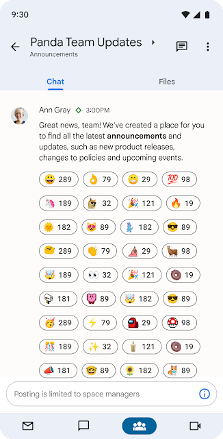
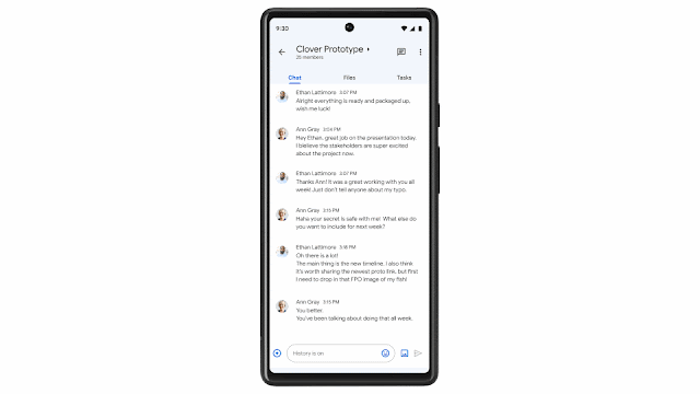
What's Changing Last year, we announced plans to wind down Currents detailed guidance for Workspace administrators and enabled customers to opt-in for automated migration of Currents data to spaces in Google Chat. export Currents data using Takeout before August 8, 2023. Beginning August 8th, Currents data will no longer be available for download. Google Chat , so teams can connect and collaborate with a shared sense of belonging. Over the last year, we've delivered features designed to support community engagement at scale, and will continue to deliver more. Here is a summary of the features with additional details below: new ways for organizations to share information across the enterprise with announcements in Google Chat . This gives admin controls to limit permissions for posting in a space, while enabling all members to read and react, helping ensure that important updates stay visible and relevant. Later this year, we plan to simplify membership management by integrating Google Groups with spaces in Chat, enable post-level metrics for announcements, and provide tools for Workspace administrators to manage spaces across their domain. Announcements in Google Chat Managing space membership with Google Groups new ways to make conversations more expressive and engaging such as in-line threading to enable rich exploration of a specific topic without overtaking the main conversation and custom emojis to enable fun, personal expression.In-line threaded conversations Discover and join communities with up to 8,000 members discover and join communities of shared interest . By searching in Gmail , users can explore a directory of available spaces covering topics of personal or professional interest such as gardening, pets, career development, fitness, cultural identity, and more, with the ability to invite others to join via link. Last year, we increased the size of communities supported by spaces in Chat to 8,000 members , and we are working to scale this in a meaningful way later this year. A directory of spaces in Google Chat for users to join. tools for content moderation and data management . Last year, we introduced space managers , a community lead with abilities to moderate conversation and manage membership , and last year at NEXT, we rolled out data loss prevention (DLP) for Chat. We will continue to enhance community health and data security for Google Chat. integrations with essential third-party apps such as Jira, GitHub, Asana, PagerDuty , Zendesk and Salesforce . Many organizations have built custom workflow apps using low-code and no-code tools , and we anticipate that this number will continue to grow with the GA releases of the Chat API and AppSheet’s Chat app building capabilities later this year.Who's impacted Admins and end users
Why it’s important The transition from Currents to spaces in Google Chat removes a separate, siloed destination and provides organizations with a modern, enterprise-grade experience that reflects how the world is working today. Google Workspace customers use Google Chat to communicate about projects, share organizational updates, and build community.
Recommended action
Availability Spaces in Google Chat are available to all Google Workspace customers and users with personal Google Accounts. Resources
Google
Labels:
Currents
,
Google Chat
,
Other
Filter by product
Filter by date
Subscribe by feed
Subscribe by email
Localized Google Workspace Updates
Español
Français 日本語 Português
Useful Links
In the Google Cloud Community, connect with Googlers and other Google Workspace admins like yourself. Participate in product discussions, check out the Community Articles, and learn tips and tricks that will make your work and life easier. Be the first to know what's happening with Google Workspace.
______________
On the “What’s new in Google Workspace?” Help Center page, learn about new products and features launching in Google Workspace, including smaller changes that haven’t been announced on the Google Workspace Updates blog.
______________

.png)

.png)
.png)
 Google
Labels:
Currents
,
Google Chat
,
Other
Google
Labels:
Currents
,
Google Chat
,
Other