@media only screen and (max-width: 464px) {
.ccm-search-block-submit {
width: 100%;
border-radius: 4px !important;
margin-top: 8px;
}
}
.subscribe_communique {
margin-top: 32px;
padding: 9px 12px;
font-weight: bold;
width:100%;
text-align:center;
}
.ccm-search-block-form input {
padding:8px 12px ;
}
.ccm-search-block-form {
width:100%;
padding:0;
display: flex;
flex-direction: row;
gap:0;
justify-content: center;
flex-wrap: wrap;
}
.ccm-search-block-text {
flex-grow: 1;
border:solid 2px;
border-radius:4px 0 0 4px;
color:#D80669;
}
.ccm-search-block-submit {
border:none;
border-radius:0 4px 4px 0;
background-color:#D80669;
color:white;
}
.ccm-search-block-form h4 {
min-width:100%;
text-transform: none
}
#searchResults {
min-width:100%;
}
News
See the latest news

12-13.07: Temporary interruption of swiscovery UNIGE

Summer opening times

New agreement with the publisher Wiley
Quick access
.home_biblio_btn {
margin-top: 4px;
padding: 12px 12px;
font-weight: bold;
width: 100%;
text-align: center;
white-space: normal;
}
.home_biblio_btn_rose {
margin-top: 4px;
padding: 12px 12px;
font-weight: bold;
width: 100%;
text-align: center;
white-space: normal;
background-color:#D80669 !important;
border-color: #D80669 !important;
color:white !important;
border-radius: 0px !important;
}
.col-sm-3-dis {
position: relative;
min-height: 1px;
padding-left: 15px;
padding-right: 15px;
width: 25%;
float: left;
}
@media only screen and (max-width: 1300px) {
.col-sm-3-dis {
width: 50%;
}
}
@media only screen and (max-width: 700px) {
.col-sm-3-dis {
width: 100%;
}
}
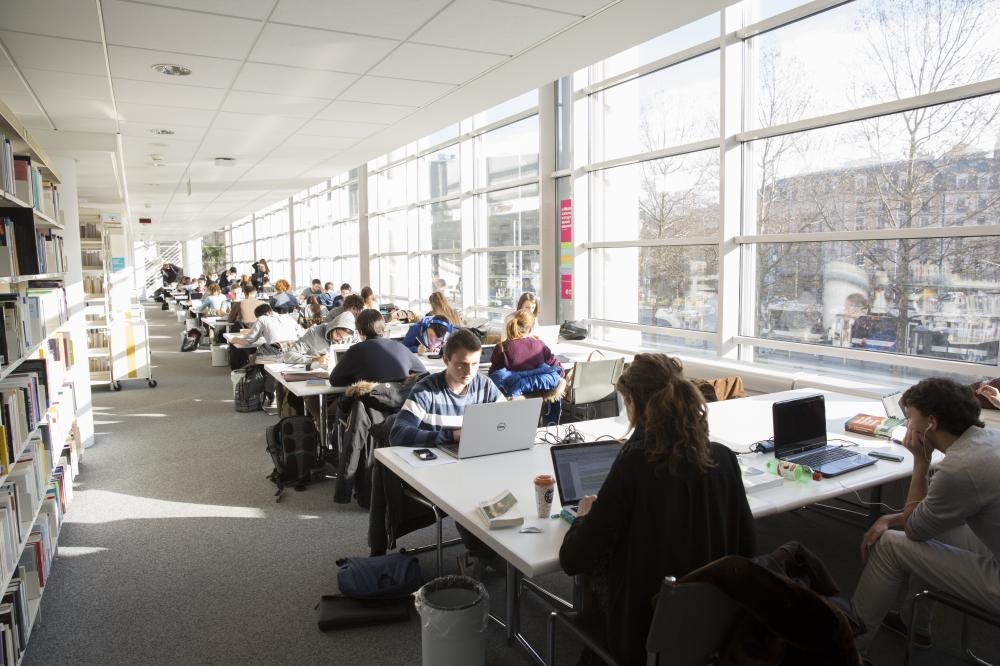
Booking a work place
Resources by subject area
Registration
Work remotely
opening hours and available places

CMU
Atrium
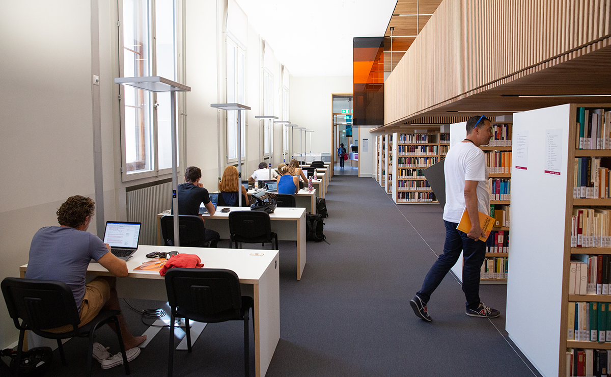
Espace Jura
Espace Battelle

BELS (Sciences II)
CUI (Battelle D)
ISE (Bd Carl-Vogt)
Mathematics (Conseil Général 7-9)
Observatory (Sauverny)
.bg-light {
background-color: #f2f2f2;
}
.bg-rose {
background-color: #d80669 !important;
}
.bg-grey {
background-color: #474747 !important;
}
.text-white {
color: #fff !important;
;
}
.text-rose {
color: #d80669 !important;
}
.py-4 {
padding-top: 1rem;
padding-bottom: 1rem;
}
.my-4 {
margin-top: 0px;
margin-bottom: 0px;
}
.px-4 {
padding-right: 1rem;
padding-left: 1rem;
}
.text-uppercase {
text-transform: uppercase;
}
.btn-rose {
background-color: #d80669;
padding: .5rem;
display: flex;
align-items: center;
margin-right: .5rem;
}
.btn-rose.half {
background: rgb(216, 6, 105);
background: linear-gradient(45deg, rgba(216, 6, 105, 1) 48%, rgba(249, 118, 180, 1) 50%);
}
.d-flex {
padding: 1.1rem;
display: flex;
align-items: center;
flex-wrap: wrap;
}
.between {
justify-content: space-between;
align-items: flex-start;
}
.relative {
position: relative;
}
.mt-0 {
margin-top: 0;
}
#legende {
font-size: .85rem;
line-height: 1.2;
}
.row.relative .col-md-3 {
position: initial;
}
.card-content {
/* padding: 1.1rem; */
min-height: 169px;
display: flex;
flex-direction: column;
justify-content: space-between;
}
.filter.active span {
background-color: #444;
}
.filter.active:hover,
.filter.active {
color: #444;
}
.card-img {
position: relative;
display: block;
width: 100%;
}
.card-img a.svg {
position: absolute;
left: 10px;
bottom: -1px;
z-index: 99;
}
.card-img:before {
content: "";
padding-top: 52.33%;
display: block;
}
.card h4 {
font-size: 1.05rem;
}
.card-img img {
position: absolute;
left: 50%;
top: 50%;
transform: translate(-50%, -50%) scale(1);
width: 100%;
height: 100%;
object-fit: cover;
transition: transform .6s cubic-bezier(.25, .46, .45, .94);
transform-origin: center;
}
.card-img:hover img {
/* transform: translate(-50%, -50%) scale(1.1); */
}
.card-links {
/* position: absolute;
top: 195px;
width: 241px; */
display: flex;
flex-direction: column;
padding: 1rem;
display: none;
z-index: 999;
}
.card {
transition: all .3s ease;
}
.faible {
opacity: .3;
}
.card:hover .card-links {
display: flex;
}
.card-links a {
color: #fff !important;
padding: .25rem 0;
}
.card h4 a:hover,
.card-links a:hover {
text-decoration: underline !important;
}
.extender {
display: flex;
align-items: center;
padding: .25rem;
/* cursor: pointer; */
margin-top: 0px;
}
.chover {
cursor: pointer;
}
.extender:hover {
/* background: rgba(0, 0, 0, 0.4); */
}
.popup {
position: absolute;
top: 185px;
left: 15px;
width: calc(100% - 30px);
background: #fff;
color: #000;
padding: 1rem;
font-size: 1rem;
line-height: 1.5;
z-index: 9999;
display: none;
box-shadow: 0 1px 6px 0 rgb(32 33 36 / 28%);
}
.active .extender svg {
transform: rotate(180deg);
}
.active .popup {
display: block;
}
.svg-line {
border-top: 1px solid rgba(255, 255, 255, .4);
padding-top: 1rem;
}
.svg-line {
position: relative;
}
.svg-line svg {
margin-right: 1rem;
}
#removeall {
display: none;
}
.biblio-disc {
color: white;
width: 99%;
}
@media only screen and (max-width: 1300px) {
.popup {
top: 160px;
}
.card-links {
width: 191px;
padding-left: 1rem;
padding-right: 1rem;
}
.card-content {
min-height: 179px;
}
}
@media only screen and (max-width: 980px) {
.popup {
top: 0px;
position: relative;
left: 0;
width: 100%;
}
.row.relative .col-md-3 {
margin-bottom: 2rem;
}
.card-links {
position: relative;
display: flex;
top: 0;
left: 0;
width: 100%;
padding-top: 0px;
padding-bottom: 0px;
padding-left: 1rem;
padding-right: 1rem;
}
}
Agenda
Full Agenda
.unige-agenda div.calendar {
max-height: 600px;
}
.unige-agenda div.calendar_date {
padding: 5px 5px;
font-size: 14px;
font-weight: bold;
}
.unige-agenda {
background-color: white;
padding: 0 0 25px;
}
.unige-agenda div.calendar_events {
font-size: 16px;
}