/* You can add your own CSS here. Click the help icon above to learn more. */ .b-hscrl-pillar-services { margin-bottom: 30px; } .page-id-20784 #cal-container .fc-content { font-size: .7rem!important; white-space: nowrap; } .c-tabs__content.tab-active { display: block!important; margin-top: 20px; } table h2, table h3, table h4 { margin: 0 0 20px; } .c-login-box { margin: 0 !important; } .student-notices-list { margin-top: -75px } .c-icon-twitter { background-image: url('https://cu-production.s3.amazonaws.com/theme-admissions-2020/assets/img/x-icon.png') !important; } @media only screen and (max-width: 768px) { .student-notices-list { margin-top: 0; } } .student-note-li:before { max-height: 9px; max-width: 9px; margin-right: 18px; min-height: 9px; min-width: 9px; }
@media screen and (min-width: 320px) { .b-nav-topbar__link { padding-left: 0; } .cur-students-nav-link { border-left: 1px solid #EDEDED; height: 60%; width: 120px; flex: none; flex: 0; padding-left: 17px; margin-right: 17px; margin-top: auto; margin-bottom: auto; } .b-nav-topbar__logo { margin-right: 10px; width: 160px !important; flex: initial; background-image: none; } .b-nav-topbar__nav-list li a, .b-nav-topbar__dropdown-sub-menu li a, .b-nav-topbar__nav-list .menu-item a, .b-nav-topbar___text--students { text-transform: capitalize !important; font-weight: 500 !important; } } @media screen and (max-width: 1024px) { .b-nav-topbar__utility { flex: auto; flex-direction: row; display: flex; justify-content: flex-end; } } @media screen and (min-width: 1025px) { .b-nav-topbar__search-query { margin-left: 2px; max-width: 200px border: 1px solid #E6E6E6 !important; border-radius: 10px !important; width: auto; } .b-nav-topbar__nav { margin-right: 0 !important; padding-left: 0; -webkit-box-flex: 1; -ms-flex: 1; flex: 1; } input.b-nav-topbar__search-input { max-width: 115px; padding: 10px 0 10px 10px; } .b-nav-topbar__search-submit { display: inline-block !important; vertical-align: middle !important; margin-right: 10px; } .b-nav-topbar__dropdown--students span { padding-right: 15px !important; padding-left: 0 !important; } div.b-nav-topbar__dropdown.b-nav-topbar__dropdown--students.u-border-n.u-text-align-c > ul > li > span > i { transform: rotate(90deg) !important; } .cur-students-nav-link { margin-left: auto; } .desk-nav-search { box-shadow: none; border-left: 1px solid #EDEDED; } } @media (min-width: 1025px) { .b-nav-topbar__nav-list li a { font-size: 1rem; } } @media screen and (min-width: 320px) { .b-nav-topbar__link { padding-left: 0; } .cur-students-nav-link { border-left: 1px solid #EDEDED; height: 60%; width: 120px; flex: none; flex: 0; padding-left: 17px; margin-right: 17px; margin-top: auto; margin-bottom: auto; } .b-nav-topbar__logo { margin-right: 10px; width: 160px !important; flex: initial; background-image: none; } .b-nav-topbar__nav-list li a, .b-nav-topbar__dropdown-sub-menu li a, .b-nav-topbar__nav-list .menu-item a, .b-nav-topbar___text--students { text-transform: capitalize !important; font-weight: 500 !important; } } @media screen and (max-width: 1024px) { .b-nav-topbar__utility { flex: auto; flex-direction: row; display: flex; justify-content: flex-end; } } @media screen and (min-width: 1025px) { .b-nav-topbar__search-query { margin-left: 2px; max-width: 200px border: 1px solid #E6E6E6 !important; border-radius: 10px !important; width: auto; } .b-nav-topbar__nav { margin-right: 0 !important; padding-left: 0; -webkit-box-flex: 1; -ms-flex: 1; flex: 1; } input.b-nav-topbar__search-input { max-width: 115px; padding: 10px 0 10px 10px; } .b-nav-topbar__search-submit { display: inline-block !important; vertical-align: middle !important; margin-right: 10px; } .b-nav-topbar__dropdown--students span { padding-right: 15px !important; padding-left: 0 !important; } div.b-nav-topbar__dropdown.b-nav-topbar__dropdown--students.u-border-n.u-text-align-c > ul > li > span > i { transform: rotate(90deg) !important; } .cur-students-nav-link { margin-left: auto; } .desk-nav-search { box-shadow: none; border-left: 1px solid #EDEDED; } } @media (min-width: 1025px) { .b-nav-topbar__nav-list li a { font-size: 1rem; } }

Wednesday, May 1, 2024

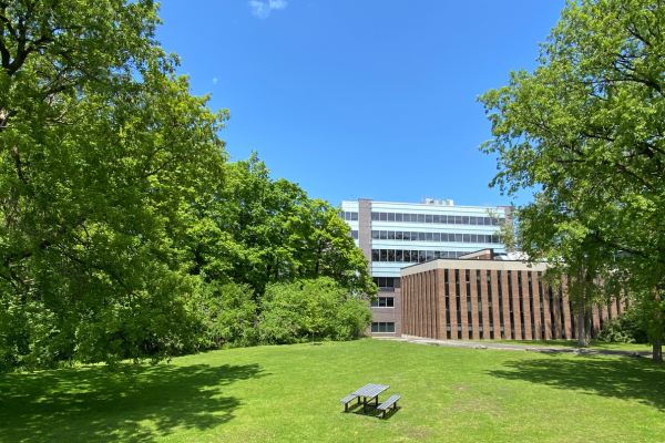
Construction in Quad

Facilities Management and Planning (FMP) has several construction projects about to start across campus, including in the quad.

This includes the demolition of the south-east staircase, which has now been closed off around the construction zone. Fencing was also erected around the grassed area in the quad on Monday, April 29, 2024.

FMP is investigating reports of compromised trees and possible removal. This fencing is for safety purposes.

Wednesday, May 1, 2024 in
Share: Twitter, Facebook

More News Posts

Photo for the news post: Safer Substance Use in the Summer May 17, 2024

Safer Substance Use in the Summer

The weather is beautiful and outdoor parties, concerts, beach days and patio hangs beckon. It’s no secret weather plays a role in our overall wellness and mental health – and... More

Photo for the news post: Anne Bowker Appointed Dean of the Faculty of Arts and Social Sciences May 15, 2024

Anne Bowker Appointed Dean of the Faculty of Arts and Social Sciences

To all members of the Carleton community, On behalf of Interim President Jerry Tomberlin, I am pleased to announce Anne Bowker as the new Dean of the Faculty of Arts... More

Photo for the news post: Deferred Winter Term Examinations May 15, 2024

Deferred Winter Term Examinations

Full winter, late winter, and fall/winter deferred final examinations will be held Friday, May 17 to Wednesday, May 29, 2024. The Exam Support Network will be operating during the deferred... More

We're here to help you succeed!

Use our services search to explore our many support services.

Cookies Notice

This site uses cookies to offer you a better browsing experience. Find out more on how we use cookies and how you can change your settings.

.closed { display:none; } .expander { width: 275px; } AskmeAsk Me

AskMe

What can we help you find?
Discover More Services