Your complete student experience hub – access Carleton Central, email and Brightspace.
 Login
.b-banner--image--welcome-to-the-summer-term {
background-image: url('https://students.carleton.ca/wp-content/uploads/2017/07/Homepage-banner-1600x700-34-1.png');
background-position: 50%;
}
@media ( min-width: 768px ) {
.b-banner--image--welcome-to-the-summer-term {
{
background-image: url('https://students.carleton.ca/wp-content/uploads/2017/07/Homepage-banner-1600x700-34-1.png');
background-position: 50%;
}
}
@media ( min-width: 1024px ) {
.b-banner--image--welcome-to-the-summer-term {
{
background-image: url('https://students.carleton.ca/wp-content/uploads/2017/07/Homepage-banner-1600x700-34-1.png');
background-position: 50%;
}
}
Login
.b-banner--image--welcome-to-the-summer-term {
background-image: url('https://students.carleton.ca/wp-content/uploads/2017/07/Homepage-banner-1600x700-34-1.png');
background-position: 50%;
}
@media ( min-width: 768px ) {
.b-banner--image--welcome-to-the-summer-term {
{
background-image: url('https://students.carleton.ca/wp-content/uploads/2017/07/Homepage-banner-1600x700-34-1.png');
background-position: 50%;
}
}
@media ( min-width: 1024px ) {
.b-banner--image--welcome-to-the-summer-term {
{
background-image: url('https://students.carleton.ca/wp-content/uploads/2017/07/Homepage-banner-1600x700-34-1.png');
background-position: 50%;
}
}
Welcome to the Summer Term
- Login
Your complete student experience hub – access Carleton Central, email and Brightspace.
Login
Emergency Notification System Test on Thursday, May 9, 2024
Construction in Quad

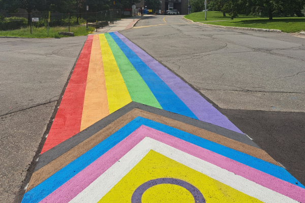
Welcome to the Summer Term

Celebrating Asian Heritage Month
View More News → .b-listing-news-services--featured, .b-listing-news-services-mobile-bg { background-image: url( 'https://students.carleton.ca/wp-content/uploads/2017/07/Homepage-headline-image-5-1.png' ) !important; }Student Headlines
Celebrating Asian Heritage Month
Celebrating the stories, research and impact made by people of Asian descent at Carleton.
Read more
Student Notices
- Carleton Announces 17th President and Vice-Chancellor
- Emergency Notification System Test on Thursday, May 9, 2024
Emergency Notification System Test on Thursday, May 9, 2024
Construction in Quad
Welcome to the Summer Term
Celebrating Asian Heritage Month

Construction on Exterior Stairs and Pathway
Upcoming Rhodes Scholarship Info Webinars

Carleton Announces 17th President and Vice-Chancellor

Celebrating Convocation With the Class of 2024
Important Dates
View All Important Dates →
Featured
From Campus to Career: Bridging the Gap with Workplace Etiquette
Student Events
-
Learn to Meditate
-
Mindfulness Meditation
-
Mindfulness Meditation
-
From Campus to Career: Bridging the Gap with Wo...
Varsity Events
No upcoming varsity events.
We're here to help you succeed!
Use our service search or explore our success pillars below.
We’re here to help you succeed!
Academics
From registration to graduation, the tools for your success.
Learn more →
Finances
Learn how to fund your experience and build a budget.
Learn more →
Employability
Define your career goals and explore your future.
Learn more →
Campus Life
Discover the many ways to get involved in your community.
Learn more →
Wellness
Explore the health and wellness resources available to you.
Learn more →
Online
Helping you find success online.
Learn more →
Quote the Raven
Contribute →
Tips When Considering Renting Off-Campus
Read more →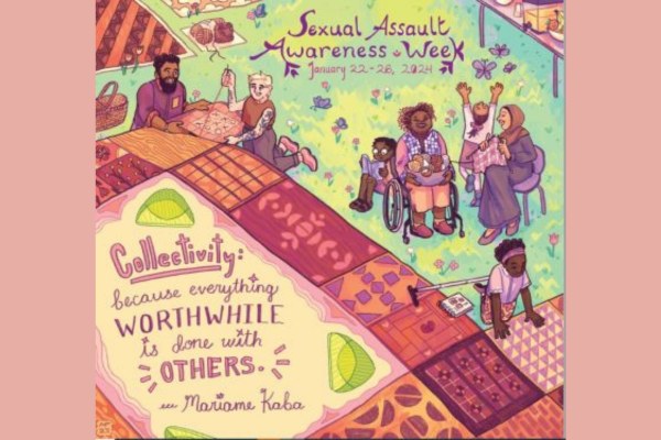
Courage at Carleton: the Importance of Sexual A...
Thinking About Finals? Let’s Get You Exam...
A Hypocrite’s Guide to University Success
Queer Wellness Resources
Pro Tips: Staying Informed of Emergencies
This site uses cookies to offer you a better browsing experience. Find out more on how we use cookies and how you can change your settings.
.closed { display:none; } .expander { width: 275px; } Ask Me