/* You can add your own CSS here. Click the help icon above to learn more. */ .b-hscrl-pillar-services { margin-bottom: 30px; } .page-id-20784 #cal-container .fc-content { font-size: .7rem!important; white-space: nowrap; } .c-tabs__content.tab-active { display: block!important; margin-top: 20px; } table h2, table h3, table h4 { margin: 0 0 20px; } .c-login-box { margin: 0 !important; } .student-notices-list { margin-top: -75px } .c-icon-twitter { background-image: url('https://cu-production.s3.amazonaws.com/theme-admissions-2020/assets/img/x-icon.png') !important; } @media only screen and (max-width: 768px) { .student-notices-list { margin-top: 0; } } .student-note-li:before { max-height: 9px; max-width: 9px; margin-right: 18px; min-height: 9px; min-width: 9px; }
@media screen and (min-width: 320px) { .b-nav-topbar__link { padding-left: 0; } .cur-students-nav-link { border-left: 1px solid #EDEDED; height: 60%; width: 120px; flex: none; flex: 0; padding-left: 17px; margin-right: 17px; margin-top: auto; margin-bottom: auto; } .b-nav-topbar__logo { margin-right: 10px; width: 160px !important; flex: initial; background-image: none; } .b-nav-topbar__nav-list li a, .b-nav-topbar__dropdown-sub-menu li a, .b-nav-topbar__nav-list .menu-item a, .b-nav-topbar___text--students { text-transform: capitalize !important; font-weight: 500 !important; } } @media screen and (max-width: 1024px) { .b-nav-topbar__utility { flex: auto; flex-direction: row; display: flex; justify-content: flex-end; } } @media screen and (min-width: 1025px) { .b-nav-topbar__search-query { margin-left: 2px; max-width: 200px border: 1px solid #E6E6E6 !important; border-radius: 10px !important; width: auto; } .b-nav-topbar__nav { margin-right: 0 !important; padding-left: 0; -webkit-box-flex: 1; -ms-flex: 1; flex: 1; } input.b-nav-topbar__search-input { max-width: 115px; padding: 10px 0 10px 10px; } .b-nav-topbar__search-submit { display: inline-block !important; vertical-align: middle !important; margin-right: 10px; } .b-nav-topbar__dropdown--students span { padding-right: 15px !important; padding-left: 0 !important; } div.b-nav-topbar__dropdown.b-nav-topbar__dropdown--students.u-border-n.u-text-align-c > ul > li > span > i { transform: rotate(90deg) !important; } .cur-students-nav-link { margin-left: auto; } .desk-nav-search { box-shadow: none; border-left: 1px solid #EDEDED; } } @media (min-width: 1025px) { .b-nav-topbar__nav-list li a { font-size: 1rem; } } @media screen and (min-width: 320px) { .b-nav-topbar__link { padding-left: 0; } .cur-students-nav-link { border-left: 1px solid #EDEDED; height: 60%; width: 120px; flex: none; flex: 0; padding-left: 17px; margin-right: 17px; margin-top: auto; margin-bottom: auto; } .b-nav-topbar__logo { margin-right: 10px; width: 160px !important; flex: initial; background-image: none; } .b-nav-topbar__nav-list li a, .b-nav-topbar__dropdown-sub-menu li a, .b-nav-topbar__nav-list .menu-item a, .b-nav-topbar___text--students { text-transform: capitalize !important; font-weight: 500 !important; } } @media screen and (max-width: 1024px) { .b-nav-topbar__utility { flex: auto; flex-direction: row; display: flex; justify-content: flex-end; } } @media screen and (min-width: 1025px) { .b-nav-topbar__search-query { margin-left: 2px; max-width: 200px border: 1px solid #E6E6E6 !important; border-radius: 10px !important; width: auto; } .b-nav-topbar__nav { margin-right: 0 !important; padding-left: 0; -webkit-box-flex: 1; -ms-flex: 1; flex: 1; } input.b-nav-topbar__search-input { max-width: 115px; padding: 10px 0 10px 10px; } .b-nav-topbar__search-submit { display: inline-block !important; vertical-align: middle !important; margin-right: 10px; } .b-nav-topbar__dropdown--students span { padding-right: 15px !important; padding-left: 0 !important; } div.b-nav-topbar__dropdown.b-nav-topbar__dropdown--students.u-border-n.u-text-align-c > ul > li > span > i { transform: rotate(90deg) !important; } .cur-students-nav-link { margin-left: auto; } .desk-nav-search { box-shadow: none; border-left: 1px solid #EDEDED; } } @media (min-width: 1025px) { .b-nav-topbar__nav-list li a { font-size: 1rem; } }

Wednesday, May 1, 2024

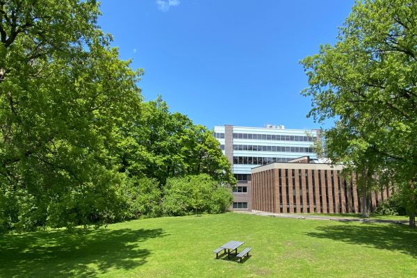
Welcome to the Summer Term

The first day of summer term classes is Monday, May 6, 2024! Whether you are catching up or getting ahead on your degree, Carleton has resources to support your success. Take advantage of the new term and let us help you along a path toward graduation.

Academics
Make sure you’re on the path to academic success by checking your audit and Academic Status Report (ASR). Whether you’re catching up or finishing up, these resources can show you if you’re on track to graduate or if it’s time to meet with an academic advisor.

Want to ensure you’re on track in your classes too? Check out the Learning Support Sessions at the Centre for Student Academic Success (CSAS). These sessions are designed to help you develop the skills you need skills to achieve academic success.

Finances
Whether you build or review your budget, the start of the term is a great time to ensure you have your finances in order. Need a little help getting your budget together? Check out the Awards Office for budgeting tips and resources.

Wellness
Start off your term by prioritizing your wellness. Schedule time for activities that you enjoy like reading, practicing mindfulness or checking out the activities hosted by Carleton Athletics. If you’re looking for new ways to manage your wellness or you want to be able to help friends when they are in need, check out the Wellness Desk in MacOdrum Library or visit the Wellness website for information and resources.
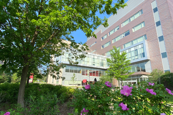
Campus Life
Campus is quieter in the summer, but there are still ways to meet new people, make friends and stay connected! Check out Campus Activity Board (CAB) events or see what the Student Experience Office has to offer!

The beginning of the term is also a great time to review the academic year calendar to ensure you’re aware of the dates and deadlines prescribed by the University Senate for academic activities.

Wednesday, May 1, 2024 in , , , , , ,
Share: Twitter, Facebook

More News Posts

Photo for the news post: Safer Substance Use in the Summer May 17, 2024

Safer Substance Use in the Summer

The weather is beautiful and outdoor parties, concerts, beach days and patio hangs beckon. It’s no secret weather plays a role in our overall wellness and mental health – and... More

Photo for the news post: Anne Bowker Appointed Dean of the Faculty of Arts and Social Sciences May 15, 2024

Anne Bowker Appointed Dean of the Faculty of Arts and Social Sciences

To all members of the Carleton community, On behalf of Interim President Jerry Tomberlin, I am pleased to announce Anne Bowker as the new Dean of the Faculty of Arts... More

Photo for the news post: Deferred Winter Term Examinations May 15, 2024

Deferred Winter Term Examinations

Full winter, late winter, and fall/winter deferred final examinations will be held Friday, May 17 to Wednesday, May 29, 2024. The Exam Support Network will be operating during the deferred... More

We're here to help you succeed!

Use our services search to explore our many support services.

Cookies Notice

This site uses cookies to offer you a better browsing experience. Find out more on how we use cookies and how you can change your settings.

.closed { display:none; } .expander { width: 275px; } AskmeAsk Me

AskMe

What can we help you find?
Discover More Services