Faculty and Staff
Student SupportWe're here to help our students succeed!
Search the student services offered on campus.
Resources to help support our students.
Use the search bar above to search for a service based on a key term. You can also view a complete A-Z listing of all student services below.
Not sure where to refer a student? Want to help support your students’ positive mental health and well-being? Visit out Supporting Our Students page to learn more about the ways we strive to promote positive mental health and assist students with realizing their full potential.
.b-trending--featured { background-image: url( '' ) !important; } .b-trending-mobile-bg { background: linear-gradient( rgba(0, 0, 0, 0.3), rgba(0, 0, 0, 0.3) ), url('') !important; }Trending Now!
Find out what's trending now in Faculty and Staff.
Save the Date: Fifth Annual Inclusion Week
Learn more → Featured StorySave the Date: Fifth Annual Inclusion Week
Join the Department of Equity and Inclusive Communities (EIC) for the fifth a...
Learn more →
Planned Web Service Outages – Thursday, June 26 & Friday, June 27
Revised Sexual Violence Policy
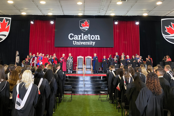
Celebrating Convocation with the Class of 2025
Early Summer Final & Full Summer Midterm Schedule Available
Aug
23
4:00 pm
Football vs Toronto
Aug
31
8:30 am
Fall Orientation Begins
Aug
31
Multi-day
Fall Orientation
Aug
31
Multi-day
SciFrosh Fall Orientation
A-Z Service Listing
- #
- A
- B
- C
- D
- E
- F
- G
- H
- I
- J
- K
- L
- M
- N
- O
- P
- R
- S
- T
- U
- V
- W
- Y
2SLGTBQ+ Student Counselling
Academic Accommodation
Academic Accommodations for Students with Disabilities
Academic Advising Centre
Academic Continuation Evaluation (ACE)
Academic Integrity
Academic Orientation Day
Academic Status Report
Academic Support for Returning Students
Academic, Research, Computer Science and Healthcare Related Workshops
Accessible Career Transitions (ACT)
Accessible Parking
Accommodated Exams
All Inclusive Washrooms
All People All Pathways
Apply to Co-op
Ask Me!
Assistive Technology Support
Attendant Services Program
Awards for Indigenous Students
Awards for Students with Disabilities
Awards Office
Become a Raven
Book a Study Room
Budget Calculator
Budgeting Tools and Resources
Bursaries
Calculate your CGPA
Campus Activity Board
Campus Recreation
Campus to Community
Career Advising Services
Career Cycle
Career Exploration Network Events
Career Workshops and Recruitment Events
Carleton Central Account
Carleton Disability Awareness Centre
Carleton Mobile
Carleton University Research Opportunity (CUROP)
Carleton360
Change of Program Elements
CHEM4U
Chonk Nation
Chosen Name Change
Classroom Study Space
Co-Curricular Record
Coffee with a Prof
Competitive Clubs
Compulsory Fees
COOP1000 Course
Counselling Services
CU on the GO
CU Umbrella Project
cuPortfolio
CUSA Clubs
CUSA Health and Dental Plan
CUSERT
CUx Experience Fund
Cyberbullying and Online Conduct Information
Deferral of Final Examination
Departmental Advisors
Departmental Scholarships & Awards
Depositing Funds
Dietary Labeling Program
Dietitian
Discrimination, Harassment and Accommodation Response
Drop-In Academic Advising Service
Elsie MacGill Learning Centre
Emergency Evacuation
Emergency Notification System
Emergency Procedures
Engineering Academic Advisors
Equity and Inclusive Communities
Events and Workshops for International Students
Exam Scheduling and Administration
Exam Support
Exemptions from International Tuition Fees
External Exams
Fall Orientation
FASS Student Ambassadors
Fee Estimator
Filing a Sexual Violence Complaint
Financial Holds
Financial Resources
Finding Books and Articles
First Year Advising
FITA
Fitness Memberships and Passes
Fitness Programs
Foundations of Engineering
FUSION
Galleria Space Booking (Academic Year)
Gender and Sexuality Resource Centre
Get Help Now
Global Opportunities & International Student Services Office
Graduate Student Counselling
Graduate Students’ Association (GSA)
Grammar Foundations
Guaranteed 12-Month Residence for International and Nursing Students
Health Promotion Services
Hey Chef
How Does Co-op Work?
How to be a University Student: Skills and Habits for Success!
How to… Drop-in Sessions
I-CUREUS
I-Start: International Student Orientation
Immigration Advising
Income Tax Forms for Students
Indigenous Peer Mentorship Program
Indigenous Student Counselling
Informal and Formal Appeal of Grade
Innovation Hub
Insurance Coverage During Unpaid Work Placement
Internal Application (Change of Degree Program)
International Internships
International Student Counselling
Intramurals
ITS Service Desk Customer Portal
Job Search Support
Job Shadow
Kinàmàgawin Indigenous Learning Certificate
Learning and Writing Support Workshops
Learning Strategy Support
Learning Support Sessions
Library Accessibility Services
Living in Residence
Looking for a Co-op Position
Lost and Found
Major Exploration
MATH4U
Mawandoseg
Meal Plans
Medical Services at Health and Counselling
Mental Health and Wellness
Microsoft Office
Minors
Missed Deferrals
MyCarletonOne Account
No Gluten Pantry
Off-Campus Housing Resources
Official Student Documents
Ojigkwanong
Ollie’s Pub & Patio
Ombuds Services
Online Job Postings
Online Resources
Opioids, Naloxone and Overdose Prevention
OSAP Information and Administration
Outgoing Exchange
Parking
Patrol Services
Paul Menton Centre (PMC)
Pay Tuition
Peer Mentoring
Personal Training
Racialized and International Student Experience (RISE)
Racialized Student Counselling
Ravens Tickets
Reduced Course Load
Release of Information to a Third Party
Research Help
Residence Counselling
Residence Events
Residence Fellow Hiring
Resume Review Services
Rooster’s Coffeehouse
Scholarships
Sexual Assault and Trauma Counselling
Sexual Violence Disclosure
Sexual Violence Policy
Sexual Violence Prevention & Survivor Support
Sexual Violence Prevention and Education Committee
Social Media
Space Booking
Spirituality Centre
Sprott Careers
Sprott Social Impact Hub
Sprott Student Consulting Group (SSCG)
Sprott Student Investment Fund (SSIF)
Student Activities Fund
Student Computer Labs
Student Group Accreditation
Student Mental Health Framework
Student Registration Assistance Team
Student Rights and Responsibilities
Student Success and Program Advising
Students as Partners Program
Substance Use Health
Summer Matchup Program
Summer Orientation Day
Summer Residence
Textbooks and Course Materials
The Flock
The Wellness Centre
Therapy Dogs
Tuition Fees
Tutoring
U-Pass
UHIP
Undergraduate Academic Petitions
Undergraduate Summer Research Internship
Upper Year Residence
USC-Food Centre
USC-Foot Patrol
Varsity Teams
Volunteer Note Takers
Wellness Counselling for Students with Disabilities
Wellness Desk
Where to Eat
Wireless and Internet
Women’s Centre
Work Study Program
Writing Consultation Sessions
Your Academic Audit
Your Degree, Your Future
Cookies NoticeThis site uses cookies to offer you a better browsing experience. Find out more on how we use cookies and how you can change your settings.
.closed { display:none; } .expander { width: 275px; }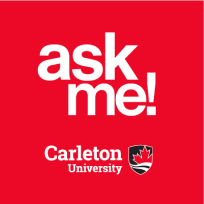 Ask Me