/* You can add your own CSS here. Click the help icon above to learn more. */ .b-hscrl-pillar-services { margin-bottom: 30px; } .page-id-20784 #cal-container .fc-content { font-size: .7rem!important; white-space: nowrap; } .c-tabs__content.tab-active { display: block!important; margin-top: 20px; } table h2, table h3, table h4 { margin: 0 0 20px; } .c-login-box { margin: 0 !important; } .student-notices-list { margin-top: -75px } .c-icon-twitter { background-image: url('https://cu-production.s3.amazonaws.com/theme-admissions-2020/assets/img/x-icon.png') !important; } @media only screen and (max-width: 768px) { .student-notices-list { margin-top: 0; } } .student-note-li:before { max-height: 9px; max-width: 9px; margin-right: 18px; min-height: 9px; min-width: 9px; }
@media screen and (min-width: 320px) { .b-nav-topbar__link { padding-left: 0; } .cur-students-nav-link { border-left: 1px solid #EDEDED; height: 60%; width: 120px; flex: none; flex: 0; padding-left: 17px; margin-right: 17px; margin-top: auto; margin-bottom: auto; } .b-nav-topbar__logo { margin-right: 10px; width: 160px !important; flex: initial; background-image: none; } .b-nav-topbar__nav-list li a, .b-nav-topbar__dropdown-sub-menu li a, .b-nav-topbar__nav-list .menu-item a, .b-nav-topbar___text--students { text-transform: capitalize !important; font-weight: 500 !important; } } @media screen and (max-width: 1024px) { .b-nav-topbar__utility { flex: auto; flex-direction: row; display: flex; justify-content: flex-end; } } @media screen and (min-width: 1025px) { .b-nav-topbar__search-query { margin-left: 2px; max-width: 200px border: 1px solid #E6E6E6 !important; border-radius: 10px !important; width: auto; } .b-nav-topbar__nav { margin-right: 0 !important; padding-left: 0; -webkit-box-flex: 1; -ms-flex: 1; flex: 1; } input.b-nav-topbar__search-input { max-width: 115px; padding: 10px 0 10px 10px; } .b-nav-topbar__search-submit { display: inline-block !important; vertical-align: middle !important; margin-right: 10px; } .b-nav-topbar__dropdown--students span { padding-right: 15px !important; padding-left: 0 !important; } div.b-nav-topbar__dropdown.b-nav-topbar__dropdown--students.u-border-n.u-text-align-c > ul > li > span > i { transform: rotate(90deg) !important; } .cur-students-nav-link { margin-left: auto; } .desk-nav-search { box-shadow: none; border-left: 1px solid #EDEDED; } } @media (min-width: 1025px) { .b-nav-topbar__nav-list li a { font-size: 1rem; } } @media screen and (min-width: 320px) { .b-nav-topbar__link { padding-left: 0; } .cur-students-nav-link { border-left: 1px solid #EDEDED; height: 60%; width: 120px; flex: none; flex: 0; padding-left: 17px; margin-right: 17px; margin-top: auto; margin-bottom: auto; } .b-nav-topbar__logo { margin-right: 10px; width: 160px !important; flex: initial; background-image: none; } .b-nav-topbar__nav-list li a, .b-nav-topbar__dropdown-sub-menu li a, .b-nav-topbar__nav-list .menu-item a, .b-nav-topbar___text--students { text-transform: capitalize !important; font-weight: 500 !important; } } @media screen and (max-width: 1024px) { .b-nav-topbar__utility { flex: auto; flex-direction: row; display: flex; justify-content: flex-end; } } @media screen and (min-width: 1025px) { .b-nav-topbar__search-query { margin-left: 2px; max-width: 200px border: 1px solid #E6E6E6 !important; border-radius: 10px !important; width: auto; } .b-nav-topbar__nav { margin-right: 0 !important; padding-left: 0; -webkit-box-flex: 1; -ms-flex: 1; flex: 1; } input.b-nav-topbar__search-input { max-width: 115px; padding: 10px 0 10px 10px; } .b-nav-topbar__search-submit { display: inline-block !important; vertical-align: middle !important; margin-right: 10px; } .b-nav-topbar__dropdown--students span { padding-right: 15px !important; padding-left: 0 !important; } div.b-nav-topbar__dropdown.b-nav-topbar__dropdown--students.u-border-n.u-text-align-c > ul > li > span > i { transform: rotate(90deg) !important; } .cur-students-nav-link { margin-left: auto; } .desk-nav-search { box-shadow: none; border-left: 1px solid #EDEDED; } } @media (min-width: 1025px) { .b-nav-topbar__nav-list li a { font-size: 1rem; } }
.b-banner--learning { background-image: url( '' ) !important; } @media ( min-width: 768px ) { .b-banner--learning { background-image: url( '' ); } } @media ( min-width: 1024px ) { .b-banner--learning { background-image: url( '' ); } }

Queer Wellness Resources

Contribute!

Quote the Raven: Carleton’s Health Promotion Team
Health Promotion Team

Carleton’s Health Promotion Team

As queer history month comes to a close, we would like to share a variety of queer health and wellness resources available on and off the Carleton campus.

The Gender and Sexuality Resource Centre (GSRC)

The GSRC, located in 427 Nideyinàn is a safer space on campus for queer and trans people to connect with community. Visit the GSRC website to find the resources they offer, including:

Check out @CUSAGSRC on Instagram to find more information about queer history month and up to date information about events going on at Carleton!

Trans and Nonbinary Resources

Visit the Trans and Non-Binary Resources website to find trans-specific information about:

Centertown Community Health Centre

They offer counselling for queer and trans youth/adults, a variety of support groups and walk-in counselling for 2SLGBTQIA+ people on Wednesdays. They are also able to provide hormone/surgery referrals. For more information, visit the Centretown Community Health Centre website.

Other Counselling Supports

The Walk-In Counselling Clinic offers walk-in counselling on a first come first served basis. It is available for Ontario residents within the greater Champlain region and has no age restrictions. They have a variety of locations and times available to view on their website.

The Max Mental Health Portal provides mental health support for guys who are into guys.

Family Services Ottawa offers support for 2SLGBTQIA+ folks as well as for women experiencing violence. Short-term and long-term counselling as well as educational services are offered.

Crisis Lines

If you are ever experiencing a crisis or are in distress, some helplines to call are:

Trans Lifeline provides peer support by and for trans people. Call: 877-330-6366

LGBT Youthline offers peer support for LGBT youth through text and online chat services. Available Sunday – Friday, 4:00 p.m. – 9:30 p.m. Text: 647-694-4275 or visit the LGBT Youthline website.

Distress Centre of Ottawa offers crisis and distress call lines for those in the Ottawa region. Distress: 613-238-3311. Crisis: 613-722-6914 or 1-866-996-0991

Quote the Raven Categories

Recent Quote the Raven Posts

Read the latest from our student Bloggers

Tell Your Story Photo thumbnail for the Quote the Raven post Quote the Raven: Profile pic

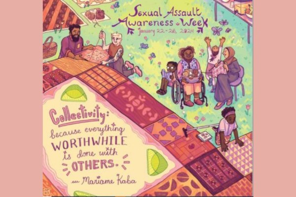
Courage at Carleton: the Importance of Sexual Assault Awareness and Support

Read It →
Photo thumbnail for the Quote the Raven post Quote the Raven: Profile pic

Thinking About Finals? Let’s Get You Exam Ready!

Read It →
Photo thumbnail for the Quote the Raven post Quote the Raven: Profile pic

Party Safe Tips

Read It →
Photo thumbnail for the Quote the Raven post Quote the Raven: Profile pic

Sexual Assault Awareness Week (SAAW) 2023 at Carleton University

Read It →
Photo thumbnail for the Quote the Raven post Quote the Raven: Profile pic

Kick Chaos to the Curb This Exam Season

Read It →
Photo thumbnail for the Quote the Raven post Quote the Raven: Profile pic

Reframing Stress

Read It →

We're here to help you succeed!

Use our services search to explore our many support services.

Cookies Notice

This site uses cookies to offer you a better browsing experience. Find out more on how we use cookies and how you can change your settings.

.closed { display:none; } .expander { width: 275px; } AskmeAsk Me

AskMe

What can we help you find?
Discover More Services